Launch sale

50% off everything. $100/mo instead of $200 — locked for as long as you stay subscribed.

See pricing →

Home/Help center/The studies

The studies

Every study — what it shows and how to set it

Veil Print — the footprint
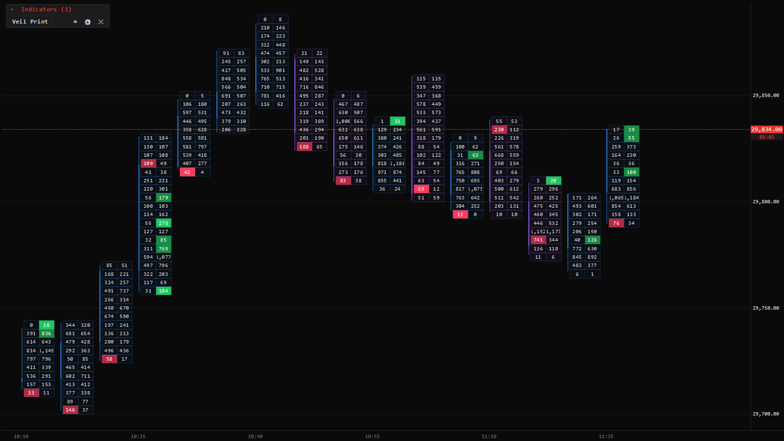
Footprint chart on NQ futures: bid and ask traded volume per price with buy and sell imbalances highlighted
Veil Print on NQ, ask×bid split — imbalanced levels lit green and red. Illustrative data.

Every executed trade, sorted into the price cell it traded at, split by which side was aggressive. It answers the question a candle cannot: not just where price went, but who was doing the work at each level on the way.

You choose a Type and a tick grouping and you are done — there are eighteen types, and each one is a complete look, not a starting point for an options safari: bid×ask, delta, volume, imbalance, heat-shaded, two-sided and more, each resolving its own numbers and painting its own cells. The cell shading follows the bar’s own direction, so the grid and the candle never disagree.

It is built from executed trades only — quotes never inflate it. While tick history is still loading, the corner shows an “≈ bars” badge naming exactly why the study is approximating, and it clears on its own.
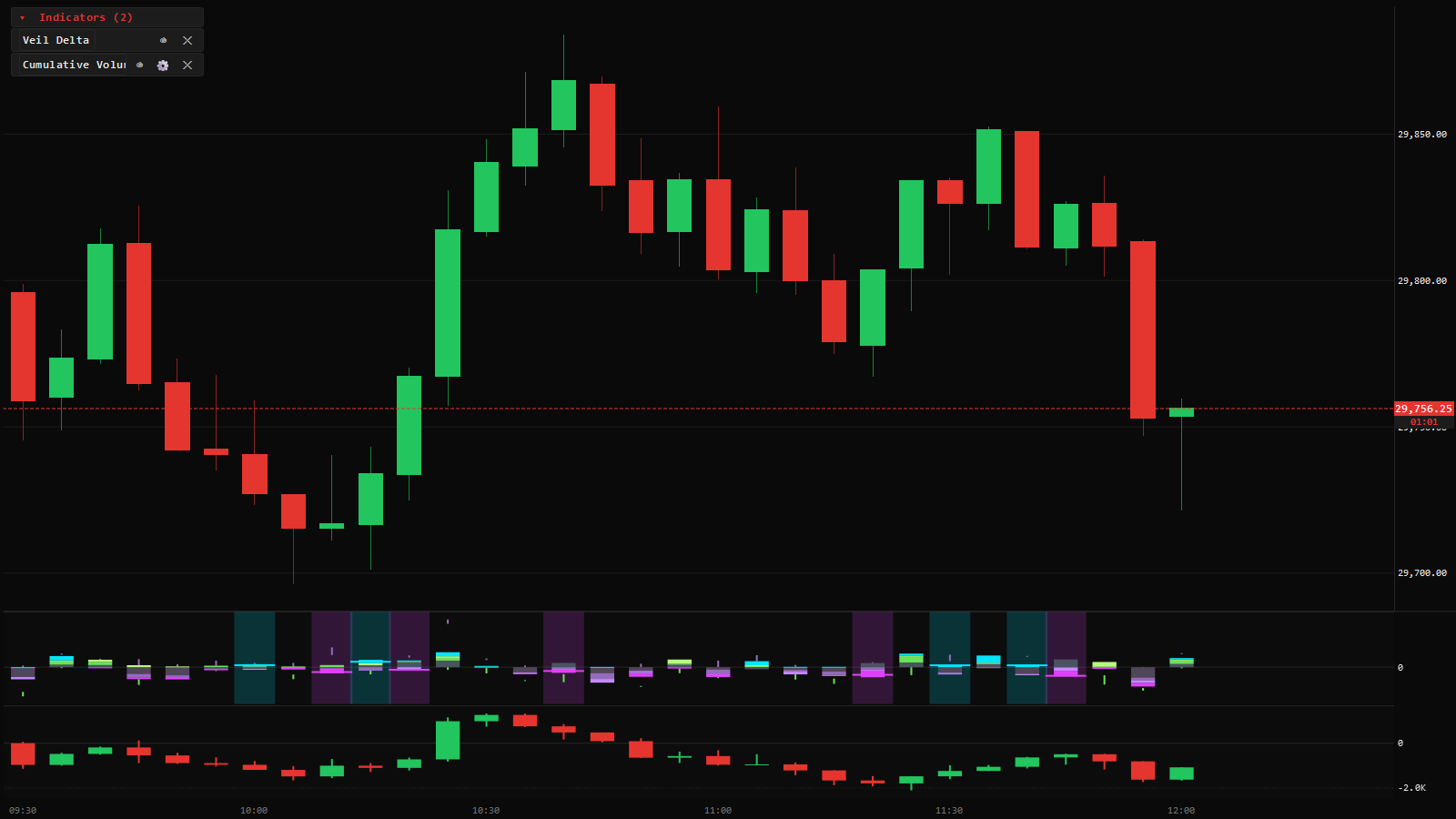
Veil Delta and Cumulative Volume Delta

Per-bar delta pane and cumulative volume delta (CVD) pane under an NQ futures chart
Veil Delta and CVD under the New York morning on NQ. Illustrative data.

Veil Delta is a pane of per-bar delta — buying minus selling, bar by bar. Cumulative Volume Delta runs the total across the session, which is where divergence lives: a higher high in price on a lower high in CVD says the push had less aggression behind it than the last one.

Both panes scale three ways — automatic, symmetric around zero, or a manual range — and like every pane you can drag the body to move it, drag its own axis to zoom it, and double-click the axis to refit.

Veil Trades — big single prints

The largest individual executions, drawn as bubbles at the price and moment they happened, sized by contracts. One 80-lot print is information; the same size spread across forty small prints is noise, and this study only shows you the former.

The filter is automatic by default — it adapts to what counts as large on the instrument that day — or set a manual floor and ceiling when you only want a specific size band.

Veil Grouped Trades — one bubble per order

A large aggressive order rarely prints once — it sweeps several resting orders and the tape shows a burst of fills milliseconds apart. This study reassembles the burst into one bubble per aggressive order, so a 150-lot sweep reads as a 150-lot decision instead of a scatter of fragments.

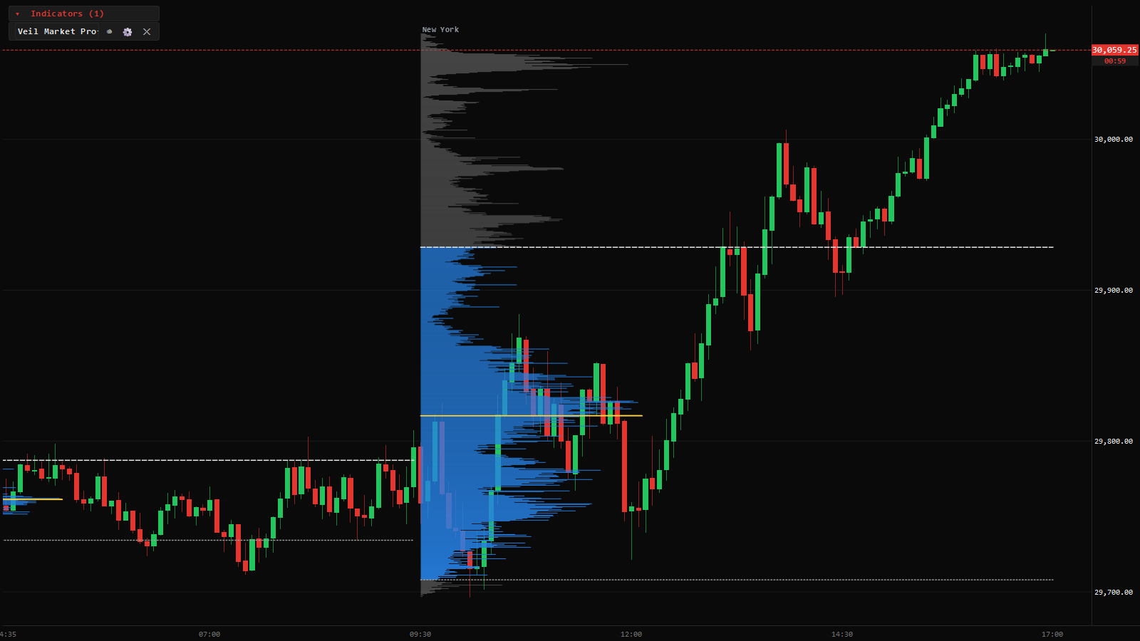
Volume Profile and Delta Profile

Session volume profiles on NQ futures with value area, VAH, VAL and point of control
Per-session profiles — the value area shaded, the POC in yellow. Illustrative data.

The Volume Profile is built from stored ticks, not from bars, so VAH, VAL and POC land on the exact tick they belong to. The value area defaults to 68% — the one-standard-deviation figure the convention derives from — and is configurable.

The Delta Profile is the same shape asked a sharper question: at each price, who was the aggressor? A high-volume level where selling was hitting the bid reads very differently from the same volume lifted at the ask. Draw either over any range, or anchor them to the session or day.

Veil Market Profile — TPO

The classic letter profile: each letter is a time period that traded at that price, so the shape shows time spent where a volume profile shows size done. Balance, single prints and poor highs and lows read at a glance, and it sits beside the volume profile rather than replacing it.

VWAP with deviation bands

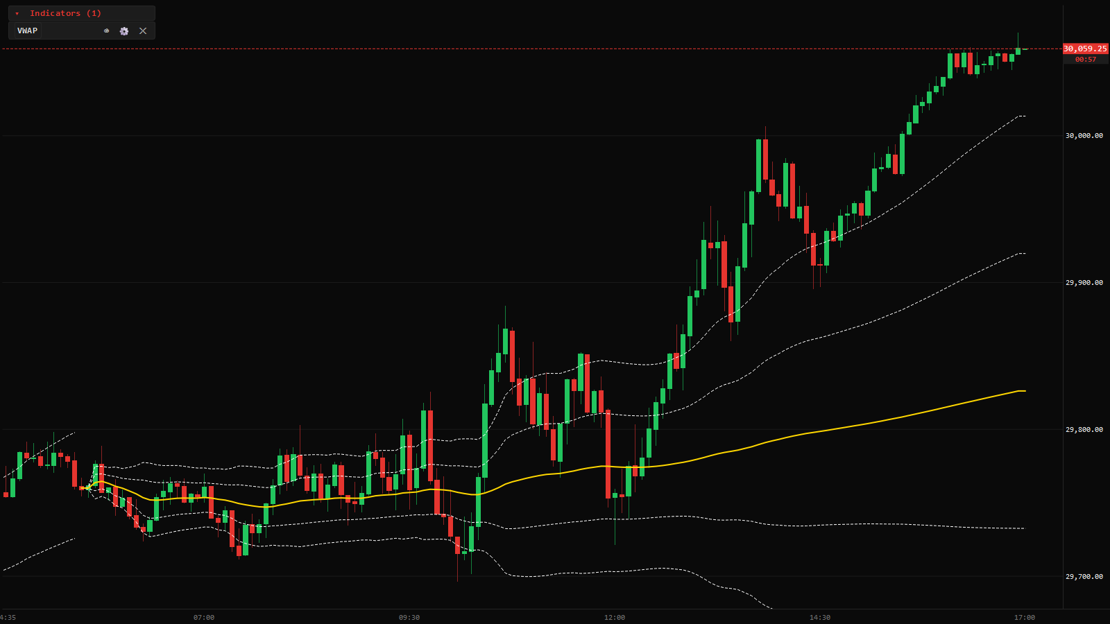
Anchored VWAP with standard deviation bands on an NQ futures session
Session VWAP with volume-weighted σ bands. Illustrative data.

Volume-weighted average price, anchored to the trading day or to the New York cash session, with ±1σ, 2σ and 3σ bands computed volume-weighted rather than eyeballed. The same engine draws it on the chart and on the heatmap, so the two windows never disagree about where it is.

Veil Depth of Market — resting size on the chart

The book’s resting limit orders, drawn on the chart at the price they rest at. It is the bridge between the chart and the ladder: you see the level you are trading and the size waiting there without switching windows.

SMT Divergence

The two index futures usually move together. When one makes a new high or low and its sibling refuses to confirm it, that disagreement — smart money divergence — is marked on the chart automatically. It is context for a level, not a signal on its own.

ADR Levels

Average daily range, projected as levels from the day’s open. When the day has already travelled its average range, continuation is statistically the harder trade — these levels put that fact on the chart.

Veil Economic Events

Scheduled macro releases — CPI, NFP, FOMC and the rest — drawn as markers at the minute they print, with upcoming events projected into the right margin. Date confidence is honest: a confirmed date draws solid, an estimated one draws dashed with a ?, and nothing is extrapolated past what is published.

The schedule works offline. Add a free statistics key in the calendar settings and past markers also carry the actual and previous prints as they were first published.

Moving averages, Bollinger, RSI, MACD, Stochastic, ATR

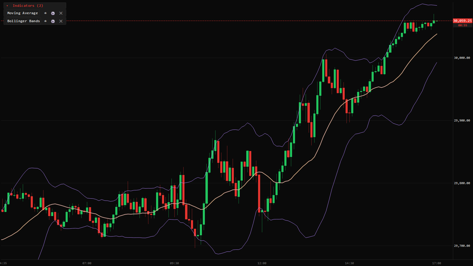
Moving average and Bollinger Bands overlaid on an NQ futures chart
A moving average and Bollinger Bands over a full session. Illustrative data.

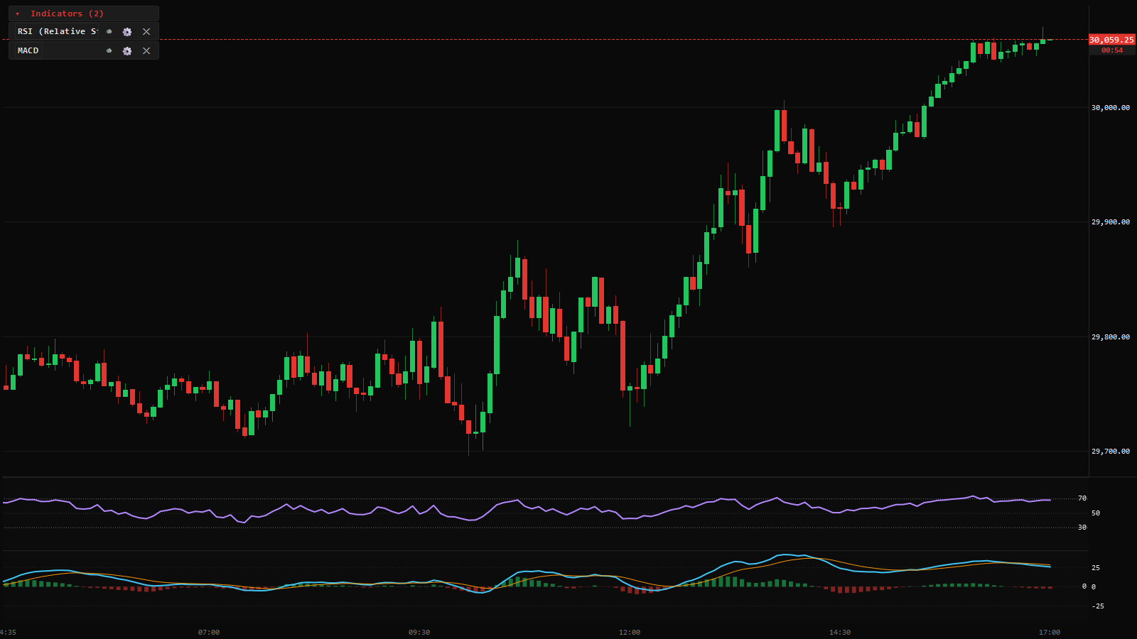
The standards are all here, done properly. The Moving Average study is one study with fourteen types — SMA, EMA, WMA, Wilder, Hull, DEMA, TEMA, VWMA, ALMA, KAMA and more — with optional trend colouring. Every oscillator pane is mouse-scaled: drag to move, drag its axis to zoom, double-click to refit, and an auto-focus pill brings it back when you wander.

RSI and MACD oscillator panes stacked under an NQ futures chart
RSI and MACD stacked as mouse-scalable panes. Illustrative data.

Can I build my own study?

Yes — there is a built-in editor for coding your own studies and strategies against the chart’s own data, and a strategy tester to run them over history. If you can express the idea as code, you can put it on the chart.

Support

Still stuck?

One person reads every message, so it may take a day — but a person does read it.